SwiftUI Patterns
Adaptive Grids for Responsive Layouts
May 31, 2026
5 min read
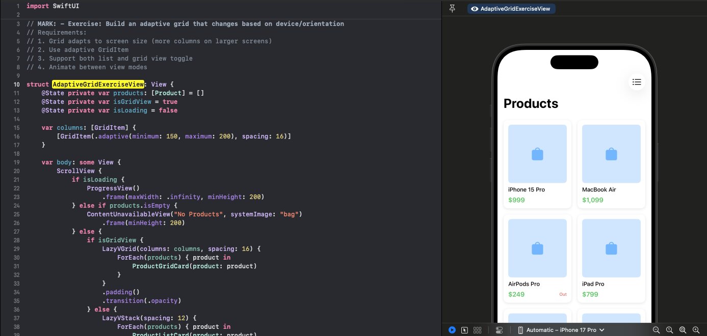
Adaptive grids automatically adjust column count based on available space. Perfect for responsive layouts across devices.
Follow along with the code: iOS-Practice on GitHub
Adaptive vs Fixed Columns
Fixed columns:
let columns = Array(repeating: GridItem(.flexible()), count: 3)
// Always 3 columns
Adaptive columns:
let columns = [GridItem(.adaptive(minimum: 150, maximum: 200))]
// As many columns as fit, each 150-200pt wide
Basic Implementation
struct AdaptiveGridExerciseView: View {
    @State private var products: [Product] = []
    @State private var isLoading = false

    var columns: [GridItem] {
        [GridItem(.adaptive(minimum: 150, maximum: 200), spacing: 16)]
    }

    var body: some View {
        ScrollView {
            LazyVGrid(columns: columns, spacing: 16) {
                ForEach(products) { product in
                    ProductGridCard(product: product)
                }
            }
            .padding()
        }
        .task {
            await loadProducts()
        }
    }
}
How Adaptive Works
The system calculates how many items fit:
| Screen Width | Min 150pt | Result |
|---|---|---|
| iPhone SE | 375pt | 2 columns |
| iPhone 15 | 393pt | 2 columns |
| iPad mini | 744pt | 4 columns |
| iPad Pro 12.9" | 1024pt | 6 columns |
Items expand between minimum and maximum to fill space evenly.
Grid Card Design
struct ProductGridCard: View {
    let product: Product

    var body: some View {
        VStack(alignment: .leading, spacing: 8) {
            RoundedRectangle(cornerRadius: 8)
                .fill(Color.blue.opacity(0.2))
                .aspectRatio(1, contentMode: .fit)
                .overlay {
                    Image(systemName: "bag.fill")
                        .font(.largeTitle)
                        .foregroundColor(.blue.opacity(0.5))
                }

            Text(product.name)
                .font(.subheadline)
                .fontWeight(.medium)
                .lineLimit(2)

            HStack {
                Text("$\(product.price, specifier: "%.0f")")
                    .font(.headline)
                    .foregroundColor(.green)

                Spacer()

                if !product.inStock {
                    Text("Out")
                        .font(.caption2)
                        .foregroundColor(.red)
                }
            }
        }
        .padding(12)
        .background(Color(.systemBackground))
        .cornerRadius(12)
        .shadow(color: .black.opacity(0.1), radius: 4, y: 2)
    }
}
GridItem Options
// Adaptive: fills available space
GridItem(.adaptive(minimum: 100, maximum: 200))

// Flexible: grows to fill, respects min/max
GridItem(.flexible(minimum: 100, maximum: 200))

// Fixed: exact size
GridItem(.fixed(150))
Spacing
Control spacing between items:
// Horizontal spacing in GridItem
GridItem(.adaptive(minimum: 150), spacing: 16)

// Vertical spacing in LazyVGrid
LazyVGrid(columns: columns, spacing: 16)
Interview Tip
Adaptive grids are essential for supporting different device sizes and orientations without writing conditional layout code.