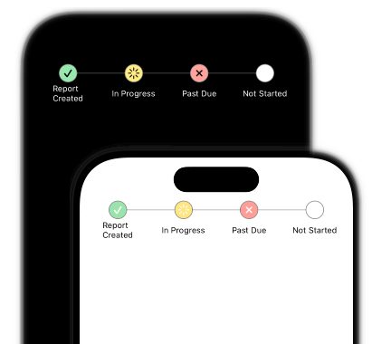
Status Tracker
You should rip this code off for your production app.
Seriously it even works well with dark mode if you're into that sort of thing.
This ones a lot of code, but luckily it's pretty simple. So let's get into the breakdown:
struct StateProgress: View {
    enum Tracking {
        // ...
    }

    let states: [Tracking] = [.done, .done, .inProgress, .error]


   // Spacing for the Tracking [o  o  o  o]
   var spacing: CGFloat {
      // ...
   }

   // Spacing for the line  --[  ]--
   var lineLength: CGFloat {
      (1.0 - spacing)
   }

    var body: some View {
        GeometryReader { geometry in
            ZStack {
                Rectangle()  // Progress bar

                HStack {
                    Spacer()
                    ForEach(states, id: \.self) { state in
                        StateProgressCircle(state: state, reader: geometry)
                        Spacer()

                        Text() // Our Titles
                    }
                }
            }
        }
    }
}
I've abbreviated the code so it's easier to see, so hopefully you get the idea. I often use enums to hold my views properties when I use swiftUI. It's a neat way to throw variables into the same view for a different outcome. The spacing variable is the spacing between the little bubbles for tracking state, while the line length is the amount of line to cut off on the edges.
This is the circle part
struct StateProgressCirlce: View {
   @Environment(\.colorScheme) var colorScheme

   let state: StateProgress.Tracking
   let reader: GeometryProxy
   let size: CGFloat = 25

   var body: some View {
      ZStack {
         Circle()
            .stroke(colorScheme == .light ? Color.black.secondary : Color.white.secondary, lineWidth: 2) // Border
            .fill(.white)   // Use this to fill white over the line
            .fill(state.color.secondary)
            .frame(width: size, height: size)

         if state != .notStarted {
            Image(systemName: state.image)
               .resizable()
               .padding(state.padding)
               .frame(width: size, height: size)
               .foregroundStyle(colorScheme == .light ? .white : .black, .clear)
         }
      }
   }
}
We do some switching for dark mode colors, but other than that it's pretty straightforward. Depending on device size, the labels start to get a bit smooshed when you add to many, but looks great on larger devices like iPads!
A couple of things to take away if you're not familiar with them:
- The GeometryProxy is the reader from the GeometryReader in the parent View. You can use those to get the devices size values and other useful information. It's helpful when you need to size UI for multiple different device sizes.
- @Environment(.colorScheme) var colorScheme is what we use to read values from the system settings about the users preference for light or dark modes.
In <a href="https://www.pixelper.com/#/blog/status-tracker-p2" style="color: blue; text-decoration: underline;text-decoration-style: dotted;"> part two</a>, we will add a few touch interactions so a user can update the states.
Let me know if you find this useful, I'd love to hear about any modifications you've made to make it better.