Collapsable Indicator
Easy Collapsible Indicators with SwiftUI
Swift UI really shines in moments like this. In fact the code is so simple, after you write something like this you end up finding it's already been incorporated into the library somewhere.
The Code
Let's take a look at the code:
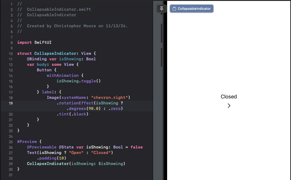
import SwiftUI

struct CollapseIndicator: View {
    @Binding var isShowing: Bool
    var body: some View {
        Button {
            withAnimation {
                isShowing.toggle()
            }
        } label: {
            Image(systemName: "chevron.right")
                .rotationEffect(isShowing ? .degrees(90.0) : .zero)
                .tint(.black)
        }
    }
}

#Preview {
    @Previewable @State var isShowing: Bool = false
    Text(isShowing ? "Open" : "Closed")
        .padding(10)
    CollapseIndicator(isShowing: $isShowing)
}
This code defines a CollapseIndicator view that takes a binding isShowing property, which represents the state of whether the indicator is showing or not. The button's label is an arrow icon ("chevron.right"), and its rotation effect is toggled based on the isShowing state. If you're looking for a way to control an entire section, consider checking out the DisclosureGroup.
How it Works
Here's a breakdown of what happens when you interact with this view:
- When the user taps the button, the
withAnimationblock executes, which animates the toggle of theisShowingproperty. - The rotation effect of the arrow icon is updated based on the new value of
isShowing. If it's true, the icon rotates by 90 degrees; otherwise, it remains at 0 degrees. - This animation creates a smooth and intuitive experience for the user.
- Notice the preview -- some of the newest syntactic sugar introduced in WWDC23. We use the new Macro
#Previewto create a simple SwiftUI preview. Also of note is the @Previewable @State var. This @Previewable is a nice way to use dynamic properties inline in with previews.
Tips and Variations
While this code snippet demonstrates a basic collapsible indicator, you can easily adapt it to suit your specific needs. Here are some ideas:
- Customize the icon: Use any system-provided image or create your own custom vector art using Shape views.
- Change the animation duration: Adjust the
withAnimationblock's parameters to control how quickly the toggle occurs. - Add a gesture recognizer: Instead of using a button, you can attach a gesture recognizer to a View and update the rotation effect based on user input.
Topics SwiftUI, #Preview, Macros, WWDC23, Rotation Effects